

Podcast – Read-Aloudability – Part 3
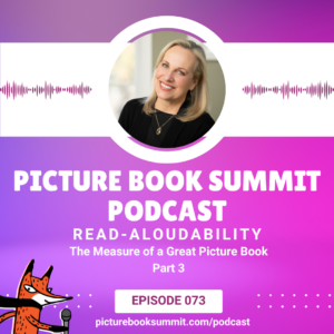
It’s time for part 3 of Read-aloudability: The Measure of a Great Picture Book. If you missed our last two episodes, you can listen to those here and here. Our first two installments reveals ways to improve read-aloudability on a story level. In our final installment, Emma Walton Hamilton shares why picture book authors, screenwriters, and playwrights have a lot in common.
With tips to make your (often adult) reader feel like a rockstar, Emma shares how to make your manuscript reader-proof.
Listen here:
Listen to the other episodes in this series here:
- 071 – Read-aloudability in Picture Books Part 1 with Katie Davis and Emma Walton Hamilton
- 072 – Read-aloudability in Picture Books Part 2 with Julie Hedlund
How can you ensure you’re using the right words to direct how your reader reads your book? Revise, revise, revise! Emma Walton Hamilton and Laura Backes reveal what those first revision steps should be.
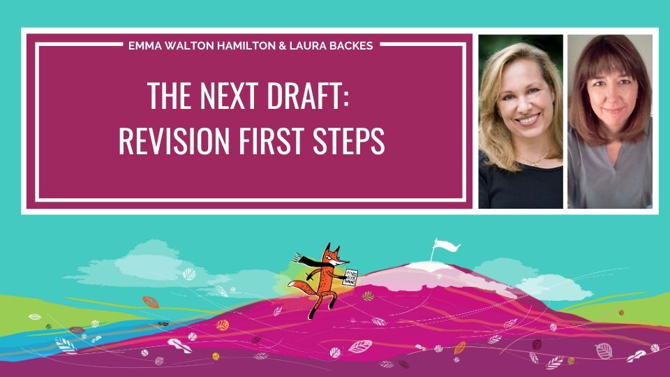
Emma Walton Hamilton and Laura Backes show how to take you fiction and narrative nonfiction picture books to the next level with basic strategies for structural revision.
Get lifetime access to The Next Draft: Revision First Steps on the Picture Book Summit FreshLearn site:
Click here!
*Picture Book Summit may receive a small commission at no cost to you when books are purchased through the link above.
Kelly Carey
January 21, 2025 at 1:51 pmWhen some of the tools of read-aloudability are related to font size, italics, bold text and other visual methods, how do you take advantage of those in pre-pub manuscript from an author only? Commas, exclamation points, and ellipsis are one thing, but how much other machinations of the text should be left for the art director or editor? Or noted in an author only manuscript?
Emma Walton Hamilton
January 27, 2025 at 8:24 amHi Kelly –
Font size, italics, and bold text are all within an author-only’s abilities to incorporate into the manuscript. Whether they end up being used the same way in the final book will depend on the editor, art director, and publisher, but these things are as much a part of your writer’s toolbox as commas and exclamation points.
In our manuscripts for THE VERY FAIRY PRINCESS and also WAITING IN THE WINGS, we used all caps and bold for emphasis in multiple places. Most of the time these choices were maintained in the final book – although some were incorporated into the illustrations in WAITING IN THE WINGS. But if you want to indicate that a character is shouting, or emphasizing something, there is absolutely nothing wrong with using these devices in your manuscript draft.
I hope that helps!
Emma